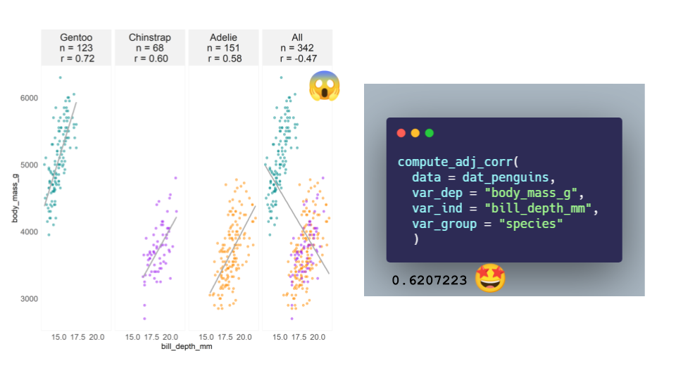
Figure 1: A Palmer penguins Simpson’s paradox yields an unadjusted correlation estimate between body mass and bill depth of -0.47 across all three species; an adjusted estimate computed from a linear mixed model is 0.62.
TL;DR
Correlations are a common analytic technique to quantify associations between numeric variables; however, estimates can be misleading when underlying groups or related observations are present. Adjusted correlation estimates can be obtained through a linear mixed model that yield sensible estimates of overall correlations across subgroups.
Overview
In various settings, correlations can be mass estimated to identify signals as to which of many independent variables have the strongest association with a dependent variable. Moreover, the correlations are commonly estimated in aggregate, or total, across may subgroups. Example applications include:
market research, when evaluating associations between product ratings and product sales across many products, in order to identify attributes with the strongest relationship with sales across all products.
biological research, when evaluating associations between gene mRNA expressions across many cancer types.
Packages
This material was developed using:
| Software / package | Version |
|---|---|
| R | 4.0.5 |
| RStudio | 1.4.1103 |
tidyverse |
1.3.0 |
broom |
0.7.9 |
performance |
0.7.2 |
lme4 |
1.1-23 |
gt |
0.3.1 |
gtExtras |
0.2.16 |
palmerpenguins |
0.1.0 |
library(tidyverse)      # general use ----
library(broom)          # tidying of stats results ----
library(lme4)           # linear mixed models ----
library(performance)    # obtain r-squared ----
library(gt)             # create table ----
library(gtExtras)       # table formatting ----
library(palmerpenguins) # simpsons paradox example ----
ggplot theme
Some personal ggplot preferences for use later.
theme_shannon <- function(){
  # theme minimal creates white background and removes ticks on axes ----
  theme_minimal() +
  theme(
    # removes grid lines from plot ----
    panel.grid = element_blank(),
    # moves legend to top instead of side ----
    legend.position = "top",
    # removes title from legend, often superfluous ----
    legend.title = element_blank(),
    # creates the light gray box around the plot ----
    panel.background = element_rect(color = "#F2F2F2"),
    # creates the gray background boxes for faceting labels ----
    strip.background = element_rect(
      color = "#F2F2F2",
      fill = "#F2F2F2"
    ),
    # if using facet grid, this rotates the y text to be more readable ----
    strip.text.y = element_text(angle = 0),
    # this produces a fully left justified title ----
    plot.title.position = "plot"
  )
}
Introduction to correlations
Correlations (r) take on values between -1 and 1, and measure the strength of the linear association between two numeric variables. Here are the three extreme forms of correlation:
A value of 0 indicates no linear association, whereas values of -1 or 1 indicate a perfect linear association. Two conditions that need to be satisfied for good correlation estimates are:
The relationship is linear.
The observations are independent.
The linearity of the relationship can be evaluated by examining a scatter plot. Independence of observations is evaluated by thinking about the origin and nature of the data. A classic way of violating the independence assumption is when observations arise from repeated measures; a less obvious way the independence observation can be violated is from what Isabella Ghement refers to as a random grouping factor.
Let’s check this out by examining correlations from a Simpson’s paradox example. 🧐
Simpson’s paradox: a Palmer penguins example
The Palmer penguins data set comes from the palmerpenguins package. Andrew Heiss recently tweeted a quick demonstration of a Simpson’s paradox for this data, where the relationship between bill_depth_mm and body_mass_g can appear differently when analyzed across all species of penguins versus within species.
For initial data preparation, I am retaining the relevant variables, removing missing observations, and creating a duplicate of the species variable for point colors and faceting later.
dat_penguins <- penguins %>%
  dplyr::select(species, bill_depth_mm, body_mass_g) %>%
  # duplicate species variable for coloring & grouping ---
  mutate(species_category = species) %>%
  drop_na()
# species colors used in the palmerpenguins readme ----
colors_penguins <- c(
  "Adelie" = "darkorange",
  "Chinstrap" = "purple",
  "Gentoo" = "cyan4"
  )
Let’s examine the correlations between bill_depth_mm and body_mass_g for the three penguin species individually, as well as across all species.
dat_penguins %>%
  # add stack for all species to be analyzed together ----
  bind_rows(dat_penguins %>% mutate(species_category = "All")) %>%
  # now examine by 3 species plus all ----
  group_by(species_category) %>%
  nest() %>%
  # within each group, compute base n and correlation ----
  mutate(
    base_n = map_int(data, nrow),
    corr = map(data, ~ cor.test(x = .x$bill_depth_mm, y = .x$body_mass_g) %>% broom::tidy())
    ) %>%
  ungroup() %>%
  # bring results back to raw data ----
  unnest(c(data, corr)) %>%
  mutate(
    # create ordered facet label for plotting ----
    species_category = fct_relevel(species_category, "Gentoo", "Chinstrap", "Adelie", "All"),
    corr_label =  glue::glue("{species_category}\nn = {base_n}\n r = {scales::number(estimate, 0.01)}"),
    corr_label = fct_reorder(as.character(corr_label), as.numeric(species_category))
   ) %>%
  # create scatter plots ----
  ggplot(aes(x = bill_depth_mm, y = body_mass_g)) +
    geom_point(aes(color = species), alpha = 0.5, show.legend = FALSE) +
    geom_smooth(method = "lm", color = "darkgray", se = FALSE) +
    facet_wrap(. ~ corr_label, ncol = 4) +
    scale_color_manual(values = colors_penguins) +
    theme_shannon()
Here we see that within species the correlations between bill_depth_mm and body_mass_g are 0.72, 0.60, and 0.58. Yet when we look at the correlation across all species, we have a nonsensical estimate of -0.47 😱, which is a classical presentation of Simpson’s paradox.
Getting a reasonable estimate of the correlation between bill_depth_mm and body_mass_g across all three species requires a bit more work. To estimate a correlation that adjusts for species, we can implement a linear mixed model, also frequently referred to as a multilevel model, which “allow us to create models for situations where the observations are not independent of one another” as stated in Beyond Multiple Linear Regression: Applied Generalized Linear Models and Multilevel Models in R by Paul Roback and Julie Leger.
In this approach, we model the dependent variable of body_mass_g with a fixed effect for bill_depth_mm (what we want to draw inferences about) and a random effect for species (which can be thought of as a sample from a larger population of species that we are not interested in drawing specific inferences about). The correlation estimate adjusting for species group membership is the sign of the bill_depth_mm coefficient multiplied by the square root of the variance explained at the different species levels. Here, I use the r2_nakagawa function from the performance package to extract the relevant \(R^2\) value.
# estimate mixed model ----
mixed_model <- lme4::lmer(body_mass_g ~ bill_depth_mm + (1 | species), dat_penguins)

# retrieve sign of coefficient ----
coef_sign <- mixed_model %>%
  broom.mixed::tidy() %>%
  filter(term == "bill_depth_mm") %>%
  pull(estimate) %>%
  sign()

# retrieve r2 measure ----
r2_by_group <- performance::r2_nakagawa(mixed_model, by_group = TRUE)$R2[1]

# compute adjusted correlation ----
adj_corr <- coef_sign * sqrt(r2_by_group)

# print result ----
adj_corr
[1] 0.6207223Ah, much better! 🤩 A correlation estimate between bill_depth_mm and body_mass_g of 0.62 across all three penguins species is a much more sensible estimate.
Multiple features: spotify songs example
Data
The data comes from the TidyTuesday Spotify songs data set.
# import data ----
dat_raw <- readr::read_csv('https://raw.githubusercontent.com/rfordatascience/tidytuesday/master/data/2020/2020-01-21/spotify_songs.csv')
To reduce the scope and simplify, I am going to examine a reduced set of variables from pop, rock, or rap songs in 2019. Our goal is to understand which of energy, speechiness, acousticness, instrumentalness, liveness, and valence have the strongest association with danceability.
# initial data prep ----
dat <- dat_raw %>%
  mutate(year = str_sub(track_album_release_date, start = 1, end = 4) %>% as.numeric) %>%
  filter(playlist_genre %in% c("pop", "rock", "rap")) %>%
  filter(year == 2019) %>%
  dplyr::select(track_id, playlist_genre, danceability, energy, speechiness, acousticness, instrumentalness, liveness, valence) %>%
  # create an additional variable for genre to be used later ----
  mutate(music_category = playlist_genre)
dat
# A tibble: 3,774 x 10
   track_id             playlist_genre danceability energy speechiness
   <chr>                <chr>                 <dbl>  <dbl>       <dbl>
 1 6f807x0ima9a1j3VPbc~ pop                   0.748  0.916      0.0583
 2 0r7CVbZTWZgbTCYdfa2~ pop                   0.726  0.815      0.0373
 3 1z1Hg7Vb0AhHDiEmnDE~ pop                   0.675  0.931      0.0742
 4 75FpbthrwQmzHlBJLuG~ pop                   0.718  0.93       0.102
 5 1e8PAfcKUYoKkxPhrHq~ pop                   0.65   0.833      0.0359
 6 7fvUMiyapMsRRxr07cU~ pop                   0.675  0.919      0.127
 7 2OAylPUDDfwRGfe0lYq~ pop                   0.449  0.856      0.0623
 8 6b1RNvAcJjQH73eZO4B~ pop                   0.542  0.903      0.0434
 9 7bF6tCO3gFb8INrEDcj~ pop                   0.594  0.935      0.0565
10 1IXGILkPm0tOCNeq00k~ pop                   0.642  0.818      0.032
# ... with 3,764 more rows, and 5 more variables: acousticness <dbl>,
#   instrumentalness <dbl>, liveness <dbl>, valence <dbl>,
#   music_category <chr>
Here are the definitions of the variables, straight from the TidyTuesday repo:
| variable | class | description |
|---|---|---|
| track_id | character | Song unique ID |
| playlist_genre | character | Playlist genre |
| danceability | double | Danceability describes how suitable a track is for dancing based on a combination of musical elements including tempo, rhythm stability, beat strength, and overall regularity. A value of 0.0 is least danceable and 1.0 is most danceable. |
| energy | double | Energy is a measure from 0.0 to 1.0 and represents a perceptual measure of intensity and activity. Typically, energetic tracks feel fast, loud, and noisy. For example, death metal has high energy, while a Bach prelude scores low on the scale. Perceptual features contributing to this attribute include dynamic range, perceived loudness, timbre, onset rate, and general entropy. |
| speechiness | double | Speechiness detects the presence of spoken words in a track. The more exclusively speech-like the recording (e.g. talk show, audio book, poetry), the closer to 1.0 the attribute value. Values above 0.66 describe tracks that are probably made entirely of spoken words. Values between 0.33 and 0.66 describe tracks that may contain both music and speech, either in sections or layered, including such cases as rap music. Values below 0.33 most likely represent music and other non-speech-like tracks. |
| acousticness | double | A confidence measure from 0.0 to 1.0 of whether the track is acoustic. 1.0 represents high confidence the track is acoustic. |
| instrumentalness | double | Predicts whether a track contains no vocals. “Ooh” and “aah” sounds are treated as instrumental in this context. Rap or spoken word tracks are clearly “vocal”. The closer the instrumentalness value is to 1.0, the greater likelihood the track contains no vocal content. Values above 0.5 are intended to represent instrumental tracks, but confidence is higher as the value approaches 1.0. |
| liveness | double | Detects the presence of an audience in the recording. Higher liveness values represent an increased probability that the track was performed live. A value above 0.8 provides strong likelihood that the track is live. |
| valence | double | A measure from 0.0 to 1.0 describing the musical positiveness conveyed by a track. Tracks with high valence sound more positive (e.g. happy, cheerful, euphoric), while tracks with low valence sound more negative (e.g. sad, depressed, angry). |
# create stacked data for analysis ----
dat_stacked <- dat %>%
  # add in all level for across all genres ----
  bind_rows(dat %>% mutate(music_category = "all")) %>%
  dplyr::select(track_id, music_category, playlist_genre, danceability, energy,
                speechiness, acousticness, instrumentalness, liveness, valence) %>%
  # convert to long format for plotting and analysis ----
  pivot_longer(
    -c(track_id, music_category, playlist_genre, danceability),
    names_to = "feature",
    values_to = "value"
  ) %>%
  mutate(
    music_category = fct_relevel(music_category, "pop", "rock", "rap", "all"),
    # reordered by a sneak peak at results below ----
    feature = fct_relevel(feature, "valence", "speechiness", "energy", "acousticness", "liveness", "instrumentalness")
  )
Visual exploration
Let’s start with a visual exploration of the data.
# colors for playlist genre ----
colors_genre <- c(
  "pop" = "#E76F51",
  "rock" = "#264653",
  "rap" = "#E9C46A"
)
dat_stacked %>%
  ggplot(aes(x = value, y = danceability)) +
  geom_point(aes(color = playlist_genre), alpha = 0.2, show.legend = FALSE) +
  facet_grid(feature ~ music_category, scales = "free") +
  scale_color_manual(values = colors_genre) +
  theme_shannon()
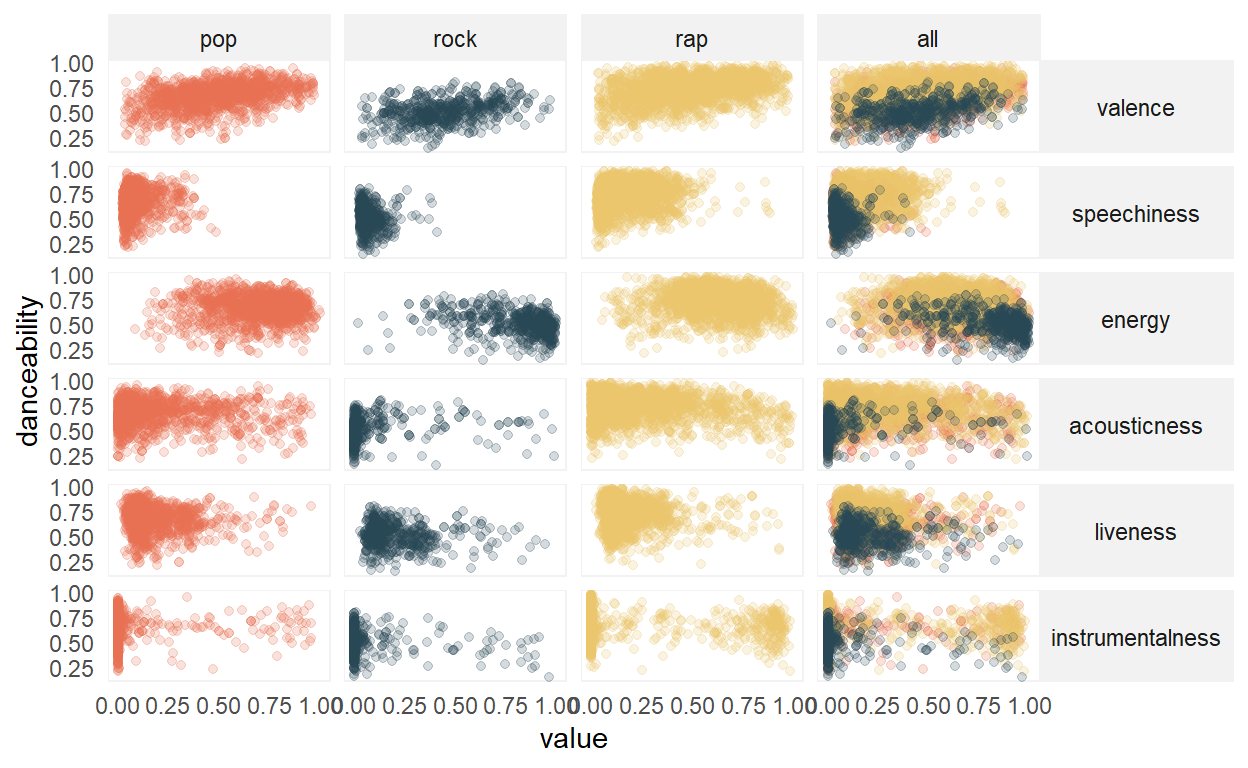
Visual inspection shows the possibility of some non-linear relationships, for example, with energy, and also some potential outliers that could influence the correlation estimate. However, for this analysis we will proceed with data as-is. In addition, note that pop and rock tend to have similar distributions, which differ from rap.
Correlation computations
First, we compute correlations for the three genres individually and the unadjusted correlations across all genres together.
Next, we compute the adjusted correlations across all genres together through the linear mixed model. To facilitate this computation, here is a quick function.
compute_adj_corr <- function(data, var_dep, var_ind, var_group){

  mixed_formula <- glue::glue("{var_dep} ~ {var_ind} + (1 | {var_group})")

  mixed_model <- lme4::lmer(mixed_formula, data)

  coef_sign <- mixed_model %>%
    broom.mixed::tidy() %>%
    filter(term == var_ind) %>%
    pull(estimate) %>%
    sign()

 r2_by_group <- performance::r2_nakagawa(mixed_model, by_group = TRUE)$R2[1]

 adj_corr <- coef_sign * sqrt(r2_by_group)

 return(adj_corr)
}
Now we compute the adjusted correlations.
results_2 <- dat_stacked %>%
  filter(music_category == "all") %>%
  group_by(feature) %>%
  nest() %>%
  mutate(
    corr = map_dbl(
      data,
      compute_adj_corr,
      var_dep = "danceability",
      var_ind = "value",
      var_group = "playlist_genre"
    )
  ) %>%
  mutate(music_category = "adjusted") %>%
  dplyr::select(music_category, feature, corr)
Finally, we combine both sets of results into a single data set for presentation.
results_all <- results_1 %>%
  bind_rows(results_2) %>%
  pivot_wider(
    names_from = "music_category",
    values_from = "corr"
    ) %>%
  mutate_if(is.numeric, round, 2) %>%
  arrange(desc(adjusted)) %>%
  rename(unadjusted = all)
Results
results_all %>%
  gt::gt() %>%
  gt::tab_header(
    title = "Correlations with danceability"
  ) %>%
  gt::tab_spanner(
    label = "Genres",
    columns = c(pop, rap, rock)
  ) %>%
  gt::tab_spanner(
    label = "All",
    columns = c(unadjusted, adjusted)
  ) %>%
  gt::cols_align(
    align = "left",
    columns = feature
  ) %>%
  gtExtras::gt_hulk_col_numeric(pop:adjusted)
| Correlations with danceability | |||||
|---|---|---|---|---|---|
| feature | Genres | All | |||
| pop | rap | rock | unadjusted | adjusted | |
| valence | 0.40 | 0.33 | 0.35 | 0.33 | 0.36 |
| speechiness | 0.06 | 0.13 | -0.11 | 0.25 | 0.09 |
| energy | 0.03 | -0.03 | -0.30 | -0.22 | -0.05 |
| acousticness | -0.05 | -0.15 | 0.14 | 0.07 | -0.08 |
| liveness | -0.08 | -0.12 | -0.12 | -0.14 | -0.11 |
| instrumentalness | -0.02 | -0.27 | -0.16 | -0.11 | -0.19 |
Here, we see that valence has the strongest association with danceability, both within each of the genres and across the three genres. Regarding valence, both the unadjusted and adjusted correlation estimates are similar. However, for other attributes, such as speechiness, the association varies by genre (weakly positive for rap, weakly negative for rock). Furthermore, the unadjusted (0.25) and adjusted (0.09) correlations differ by quite a bit, with the unadjusted correlation once again producing a nonsensical result that exceeds the correlations for any individual genre (-0.11 rock, 0.06 pop, and 0.13 rap).
Discussion
Correlations are used by researchers of all backgrounds and expertise due to their relatively straightforward computation and interpretation. When the distributions of dependent and independent variables are similar across subgroups, the unadjusted simple correlation estimates are likely to be similar to the more complex adjusted correlation estimates; however, when distributions vary by subgroups, simple correlation estimates across subgroups could be incorrect and misleading. A primary defense to guard against this is to plot your data - this can help you to identify grouping effects or when relationships are non-linear. In addition, it should be carefully considered if the relationships across groups are truly of more interest than relationships within groups, as across group results can obscure potentially interesting within group findings.
Acknowledgements
Thank you to Alex Fisher for brainstorming with me the linear mixed model approach to adjusted correlation estimates. In addition, thank you to Alice Walsh for your enthusiasm and feedback on this post.