Table of Contents
TL; DR
The officer and rvg packages can be used to create PowerPoint slides with editable ggplot graphics. Skip to creating a single PowerPoint slide or to efficiently exporting multiple PowerPoint graphics with purrr.
What is an editable PowerPoint graphic?
An editable PowerPoint graphic that is created within PowerPoint consists of two sets of editable components:
Various features of the graphic are editable, including items like size, color, and font (see Gif 1).
The data behind the graphic are editable (see Gif 2). This means that you can open the table linked to the chart and manually edit it in order to alter the data displayed in the graphic.
An editable PowerPoint graphic constructed in R through the officer + rvg functions described here produce vector graphics (i.e., shapes). This permits editing various features of the graphic (e.g., color, size), but not the data behind it (no linked table is created).
Why should I create it?
In my line of work, the primary deliverable is a PowerPoint slide deck. When creating an R graphic for a slide deck, I could export the graphic as an image (like a .png) to be inserted into PowerPoint, or I can export the graphic directly to an editable PowerPoint slide. Both of these options have pros and cons.
| Feature | PowerPoint editable graphic | Image (e.g., .png) |
|---|---|---|
| Editability | 👍 | 👎 |
| Resizing | 👎 | 👍 |
| Data table | 👎 | 👎 |
The editable PowerPoint graphic allows for direct editing in PowerPoint, but re-sizes poorly when done manually within PowerPoint. A .png image does not allow for direct editing within PowerPoint, but does nicely retain image ratios when re-sizing. Lastly, neither method produces a linked data table behind the graphic for editing.
How do I create it?
library(tidyverse)
library(here)
library(glue)
library(officer)
library(rvg)
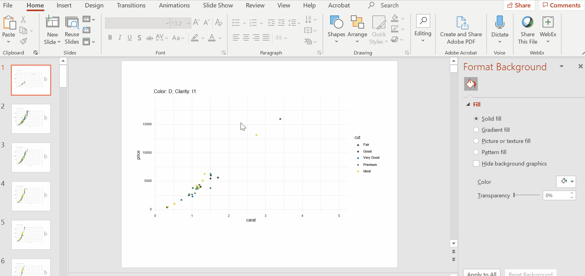
library(viridis)First, let’s create a quick graphic for demonstration purposes using ggplot2::diamonds. We subset the data on specific values of color and clarity and produce a scatter plot showing the relationship between price and carat.
p <- diamonds %>%
  filter(color == "D" & clarity == "I1") %>%
  ggplot(aes(x = carat, y = price, color = cut)) +
    geom_point() +
    theme_minimal() +
    ggtitle("Color: D; Clarity: I1")
p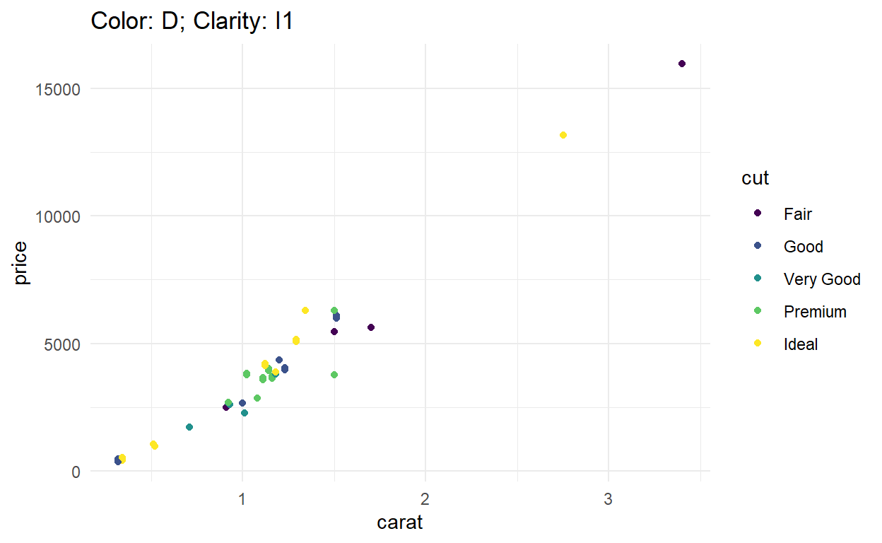
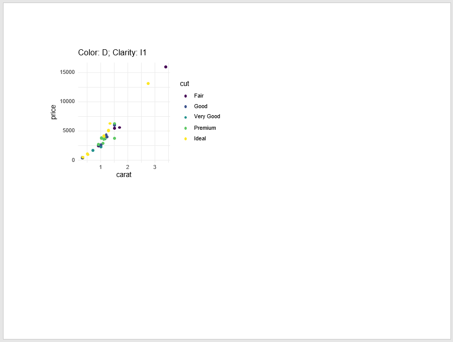
In order to export this graphic to an editable PowerPoint slide, first use the rvg package to convert the object to class dml (required to make graphic editable).
p_dml <- rvg::dml(ggobj = p)Then export the dml object to a PowerPoint slide with officer.
# initialize PowerPoint slide ----
officer::read_pptx() %>%
  # add slide ----
  officer::add_slide() %>%
  # specify object and location of object ----
  officer::ph_with(p_dml, ph_location()) %>%
  # export slide -----
  base::print(
    target = here::here(
      "_posts",
      "2020-09-22-exporting-editable-ggplot-graphics-to-powerpoint-with-officer-and-purrr",
      "slides",
      "demo_one.pptx"
    )
  )
Here is a screen shot of the resulting PowerPoint slide, or you can download demo_one.pptx.
When should I do this more efficiently?
There are 56 combinations of color and clarity in the diamonds data set; naturally, your colleague wants all 56 plots (at least for the appendix of the report 😂). So we definitely want an efficient way to do this!
Automate many plots
This work follows up on blog posts by Laurens Geffert, Len Kiefer, and Bruno Rodrigues, which were fantastic resources to help me get started. The officer package enacted changes in version 0.3.11(?) which necessitate updates to these methods (see Acknowledgements). In addition, Amber Thomas outlined a purrr work flow that resonates with me.
I start with a table outlining the 56 combinations of color and clarity.
# tibble of all possible combinations ----
diamonds_grid <- diamonds %>%
  count(color, clarity) %>%
  # for mapping, we need input values to be character ----
  mutate_all(as.character)
# view values of grid ----
diamonds_grid
# A tibble: 56 x 3
   color clarity n
   <chr> <chr>   <chr>
 1 D     I1      42
 2 D     SI2     1370
 3 D     SI1     2083
 4 D     VS2     1697
 5 D     VS1     705
 6 D     VVS2    553
 7 D     VVS1    252
 8 D     IF      73
 9 E     I1      102
10 E     SI2     1713
# ... with 46 more rows
Then I create a function that produces the plot for any given combination of color and clarity. As ggplot produces plots for the available data, there are some additional updates to this function to maintain consistency across all plots. We use a named color vector to create consistency in plotting colors across all plots, in addition to enforcing consistency in the x and y plotting ranges.
# named vector for the colors assigned to cut ----
# values are the colors assigned ----
color_cut <- viridis::viridis(5) %>%
  # assign levels of cut as names to colors ----
  rlang::set_names(levels(diamonds[["cut"]]))
# view named color vector ----
color_cut
       Fair        Good   Very Good     Premium       Ideal
"#440154FF" "#3B528BFF" "#21908CFF" "#5DC863FF" "#FDE725FF"
# function to produce scatter plot of carat and price for given values of color and clarity ----
plot_diamonds <- function(this_color, this_clarity){
  diamonds %>%
    filter(color == this_color & clarity == this_clarity) %>%
    ggplot(aes(x = carat, y = price, color = cut)) +
      geom_point() +
      theme_minimal() +
      # maintain consistent plot ranges ----
      xlim(range(diamonds[["carat"]])) +
      ylim(range(diamonds[["price"]])) +
      # maintain consistent colors for cut ----
      # show all values of cut in legend, regardless if appear in this plot ----
      scale_color_manual(values = color_cut, drop = F) +
      # title indicates which combination is plotted ----
      ggtitle(glue::glue("Color: {this_color}; Clarity: {this_clarity}"))

}
Next I utilize the plot_diamonds function with purrr to create a list with 56 ggplot objects representing all combinations of color and clarity.
diamonds_gg <- purrr::map2(
  # first argument to plot_diamonds function ----
  diamonds_grid[["color"]],
  # second argument to plot_diamonds function ----
  diamonds_grid[["clarity"]],
  # function to map ----
  plot_diamonds
)
Export many plots
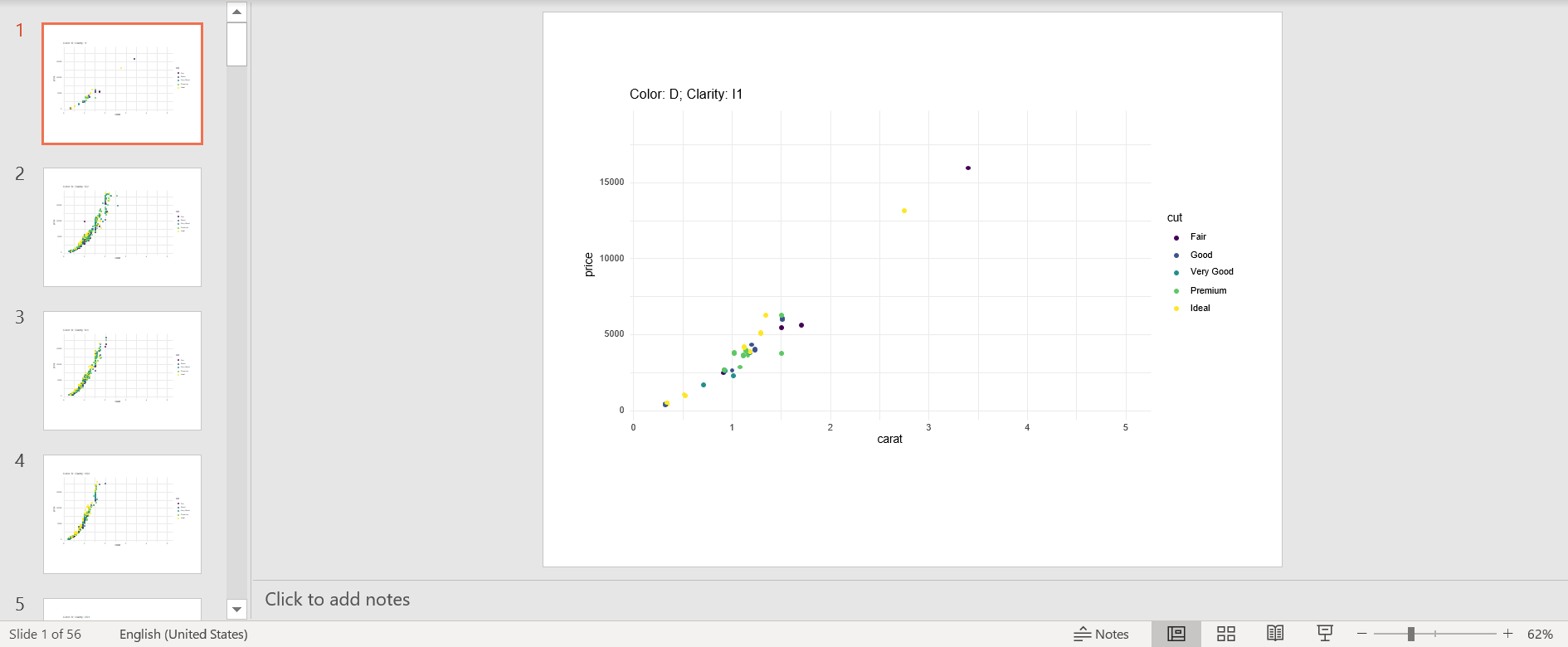
To export these, I use two helper functions. The first function, create_dml, converts the ggplot objects to dml objects.
create_dml <- function(plot){
  rvg::dml(ggobj = plot)
}
Apply this function to the list of ggplot objects to create a list of dml objects with the same dimension.
diamonds_dml <- purrr::map(diamonds_gg, create_dml)The second function automates exporting all slides to PowerPoint, with some additional options to specify the position and size (inches) of the graphic. The default size (9in x 4.95in) produces a graphic that fills a standard sized slide.
# function to export plot to PowerPoint ----
create_pptx <- function(plot, path, left = 0.5, top = 1, width = 9, height = 4.95){

    # if file does not yet exist, create new PowerPoint ----
    if (!file.exists(path)) {
        out <- officer::read_pptx()
    }
    # if file exist, append slides to exisiting file ----
    else {
        out <- officer::read_pptx(path)
    }

    out %>%
      officer::add_slide() %>%
      officer::ph_with(plot, location = officer::ph_location(
        width = width, height = height, left = left, top = top)) %>%
      base::print(target = path)
}
Note that this function opens and closes PowerPoint for each slide created, so more slides will take longer to export. This particular set of graphics took ~6 minutes to export due to the number of slides and the number of points on some slides 😬 (which is longer than usual for my typical applications).
purrr::map(
  # dml plots to export ----
  diamonds_dml,
  # exporting function ----
  create_pptx,
  # additional fixed arguments in create_pptx ----
  path = here::here(
    "_posts",
    "2020-09-22-exporting-editable-ggplot-graphics-to-powerpoint-with-officer-and-purrr",
    "slides",
    "demo_many.pptx"
    )
  )
Here is a screen shot of the resulting PowerPoint slide, or you can download demo_many.pptx.
Who should do the editing?
Now that you have editable PowerPoint slides, you have two parties capable of editing the graphics: (1) the R developer, and (2) the collaborator.
The R developer should do further slide editing when:
edits are universal (i.e., reduce size of all plots to 6in x 3in).
edits are data driven (i.e., represent all points where
caratexceeds a value of 3 as a star)
The collaborator should do further slide editing when:
edits are bespoke (i.e. Bob wants to see slide 25 in bold for the marketing team)
edits are beyond the budget (i.e., super custom axis adornment)
Limitations
While the graphics exported to PowerPoint from R are editable, they do have limitations compared to graphics created within PowerPoint.
As previously mentioned, there is no linked data table behind the graphics, which can be unnerving for a colleague who wants to quality check the figure (I often export labeled and unlabeled versions of figures for this).
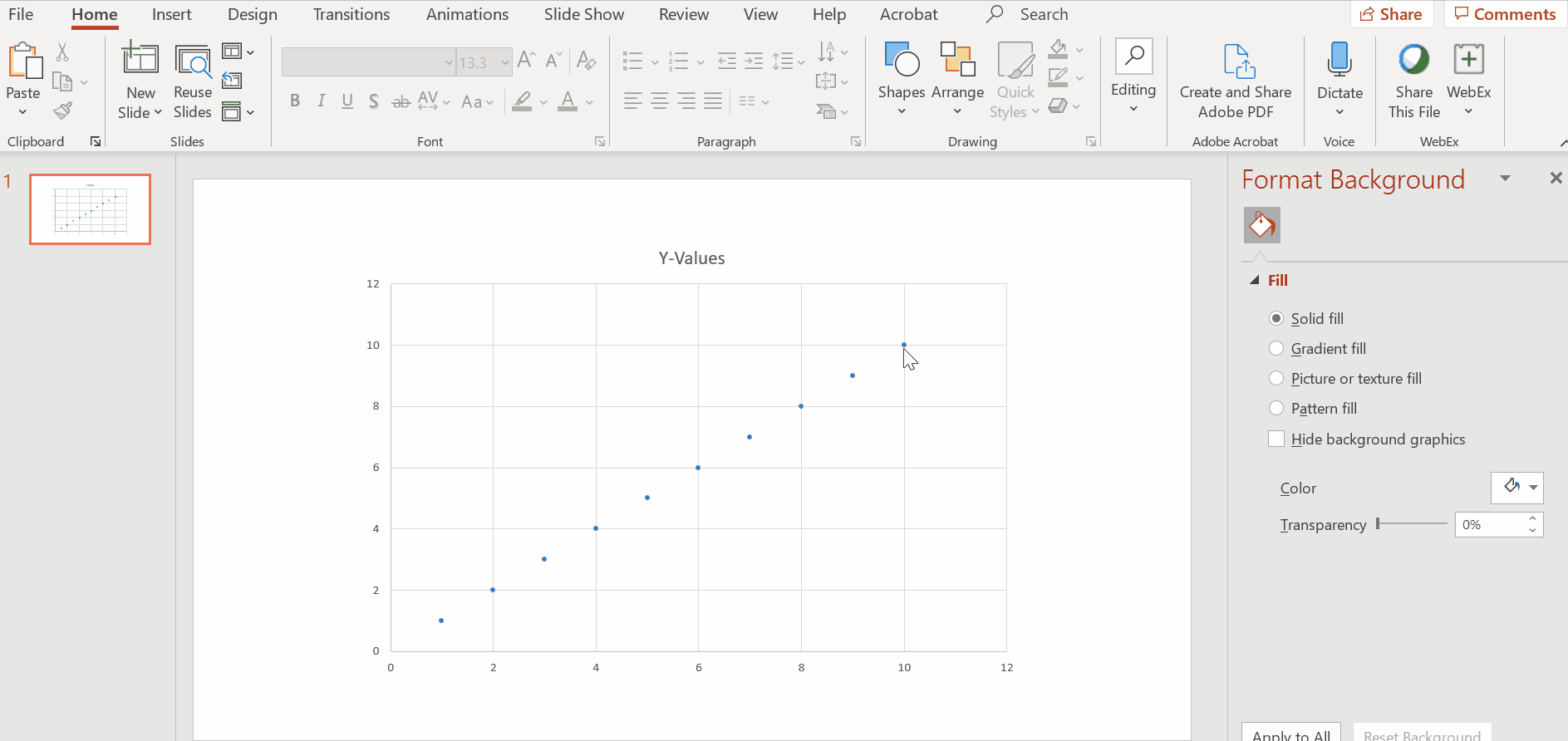
The points are not naturally grouped features as they would be for graphics created within PowerPoint. This means that if your colleagues wants to change the shade of yellow for the ideal cut diamonds they would have to click on each and every single yellow point in all slides (see Gif 3 for preview of what the slide looks like when you click around).
Summary
Editable PowerPoint ggplot graphics created through officer + rvg + purrr can be a great way to provide your colleague with fantastic graphics while still allowing them to refine the graphics with their own finishing touches. Do expect a lot of iteration on the graphic to get it as close as possible to their needs before you hit that final send on the PowerPoint deck.
Appendix
Gif 1
Demonstration of editable features in graphic created within PowerPoint. Notice that the points are automatically grouped together. Go back to What is an editable PowerPoint graphic?.
Gif 2
Demonstration of editable data table behind graphic created within PowerPoint. Go back to What is an editable PowerPoint graphic?.
Gif 3
Demonstration of editing title and single point color in graphic exported to PowerPoint by rvg + officer (notice points are not grouped). Go back to Limitations.
Acknowledgments
The create_pptx function was modified from Bruno Rodrigues. My colleague Tom Nowlan figured out the function updates for officer::ph_with (formerly officer::ph_with_vg) to export figures to a specific size and location. Thumbnail artwork was adapted from @allison_horst.